Wednesday, August 31, 2011

myTram: a personalised Melbourne network map

This is an October 2010 data visualisation project to develop a data form (object from data) that meaningfully interprets and embellishes the source data (the Melbourne tram network). The project was undertaken in collaboration with Kerrin Jefferies as part of the Master of Digital Design.

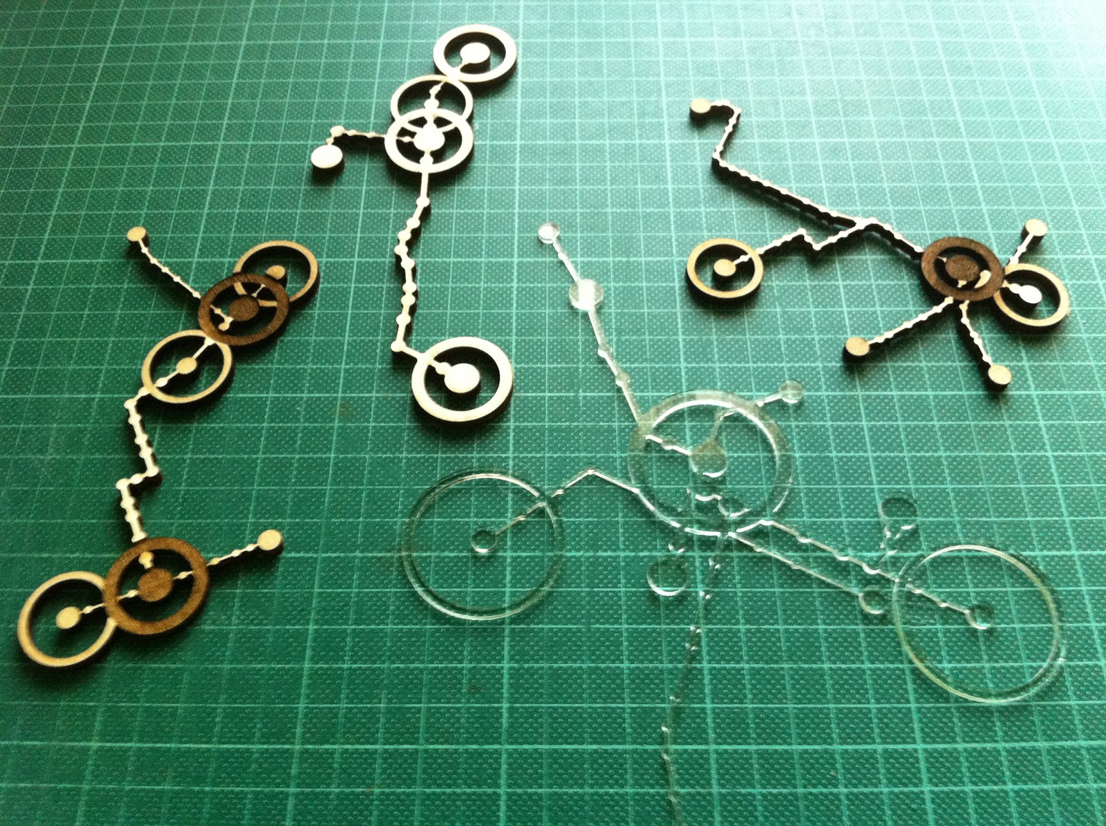
myTram data forms - laser cut/etched ply and perspex from Ponoko

Trams are critical in the definition of Melbourne urban form and culture as a primary and iconic mode of transport for inner city residents and visitors. Trams unlike trains follow the main streets, the tram network mirrors the principal geometries of the inner city grid and rotated CBD grid and as such is recognisable even to residents who do not use trams. Each route has distinct corners, bends, branches or kinks and so even a small portion of the network is identifiable.

Mapping personal use of the tram network - frequency and destination of trips, as well as the time spent at and walking range around destinations, gives a dataform that reveals substantially how the city is inhabited. As wearable jewellery or other intimate use object such as placemat or coaster, myTram is intensely personal and richly meaningful, able to prompt memory, discussion and movement from an intuitive and implicit understanding of the city to one that is more explicit.

GPS locations for each tram stop allowed accurately scaled drawing of stop locations which were matched with lists of stops on each route to approximately locate routes by drawing straight lines between stops. The route lists had misplaced stops which were removed by filtering for outlying distances between stops. As stops were located on both sides of the road and routes had travel in two directions there were selection interface issues that were exacerbated once myTrips and myStops were added. These issues were overcome with switches that could be toggled to narrow selection possibilities.

myTram interface - routes through Domain Interchange highlighted
myTram interface - myTrip Route 8 along Chapel St highlighted
myTram interface - editing time spent at and walk radius around myStops

While graphic representation on screen allowed relatively detailed information to be encoded with layered transparencies and fine lines, augmented with popups and rollovers, and navigated with filtering buttons, the laser cut data forms had to be significantly simplified to be legible. A thicker line weight was required for structural integrity and only two depths of etching were employed to ensure high contrast.

The final form was refined to just myTrips with no contextual information (grid and other routes were removed) and only two modes of trip frequency (frequent, thick line; and infrequent; thin line), time spent at myStops (primary, large radius and deep etch; and secondary, medium radius and shallow etch), and walk range around destination (greater than 500m, ring with 500m radius to scale; and less than 500m, no ring).

myTram is legible as an embellished section of a network diagram.

I reviewed this project again, now in the context of thinking about the project for the NMA collections, to remind myself of the importance of context when working with data. In this project the context is urban and personal, both rich and specific. The NMA data set is much larger and much of the context of individual objects I expect to be more ambiguous or abstract -  time, location, like items. I will have to be careful in drawing together any narrative that it is appropriate. 

Exploring the NMA catalogue - first thoughts

As part of the Master of Digital Design, this semester we will be developing data visualisation projects from the National Museum of Australia's digital catalogue. Project development can be followed with the tag 8199 (the unit number). The project is being led by Mitchell Whitelaw.

This is an exciting (and daunting) culmination of work to date. The NMA is in the process of digitally cataloguing it's very large and important collection (of collections). The NMA conserves the 'National Historical Collection' which contains more than 200,000 objects representing Australia's history and cultural heritage, of which so far 48,000 objects from 1003 collections have been catalogued. A tiny fraction of these objects make up the public exhibitions at the Museum - some of the exhibition material is valuable such as many of the indigenous artefacts, while some of it is perhaps not especially so but is important because it illustrates cultural stories (in one of the displays there is a windmill with a cut out magpie).

Phar Lap's Heart, National Museum
My first approaches to all of these objects online has me overwhelmed. Here there is no curation. I am confronted with a search box. Without having in mind something specific like Phar Lap's Heart I look to browse elsewhere. At the side there is a random selection of object thumbnails (many of the objects dont have photos, and most of them appear to be low resolution). Initially I didnt realise that these were links, but they were all the same engaging. Next there was the opportunity to browse by object type - this I found to be the most interesting - cabinets, cake tins, canoes, chemical jars, cricket balls, cut throat razors... Then there was the opportunity to browse by collection - here I was confronted by many unfamiliar names that I assumed to be donors or the focus of the collection. Unfortunately I couldn't access a description of the collection, only a list of the objects it included. Elsewhere on the NMA website I found descriptions of some of the most significant collections.

Examination of individual object records left me feeling no better connected to the material of the collections. Each item that I viewed (except Phar Lap's Heart) had a very brief factual description of the object, but little contextual information other than a date and place. I could not tell what the significant of the object was (surely some of the objects are more significant than others?) and I was not told why it was part of the National Historical Collection.

So the task I am most interested in is constructing a better narrative around these objects. Data items that stand out as possibilities to construct some analytic context are date, place, materials, dimensions, collection size and number of object type. It is my expectation that visualisations based on these data items can better situate oneself within the collection and assist navigation / browsing. It is my intention to make both visualisations of and an interface to the collection.

The designed ability to zoom in and out within a dataset and to comprehend the scale of the whole and it's parts allows large and complex data that was previously only superficially understood to become powerful and sophisticated information tools. Of course data analysis is only as valid as the source data and data can be misunderstood when it is out of context - or in a wrong or partial context.

Mitchell Whitelaw's visualisation project for the National Archives is a great demonstration of the potential for design to transform the accessibility and legibility of a large data set that was previously incomprehensible. The overview Series Browser is able to represent the entire data set of series in a way that reveals structure and relationships, while the zoomed in A1 Explorer uses a word frequency cloud and histogram to indicate some of the contents in a more succinct and engaging way than a contents or index page possibly could (the A1 series contains 65,000 items). Both visualisations suggest themes to focus or zoom further in on - and being interactive are part analytic, map and interface.

National Archives Series Browser, Mitchell Whitelaw, 2010 - series are arranged
chronologically with their size and provenance indicated